Building Trust Towards Academic Counselling
🎯 This project has been handed off and is expected to ship Fall 2025!
Project Overview
In Summer 2025, I joined AlphaMed to tackle a critical conversion challenge within their service. While shaping the product vision, I specifically focused on conducting user research with families to identify trust barriers, and translating those insights into a reliable and intuitive interface.
THE PROBLEM
From ambition to acceptance with AlphaMed
AlphaMed is an academic counselling service that guides students through medical school admissions. Since its launch, they have supported over 150 students in securing placements at top universities worldwide.
While AlphaMed’s success has largely grown through personal networks, this acquisition strategy reveals a hidden flaw: the website offers no value proposition for first-time visitors.
COMPANY INSIGHTS
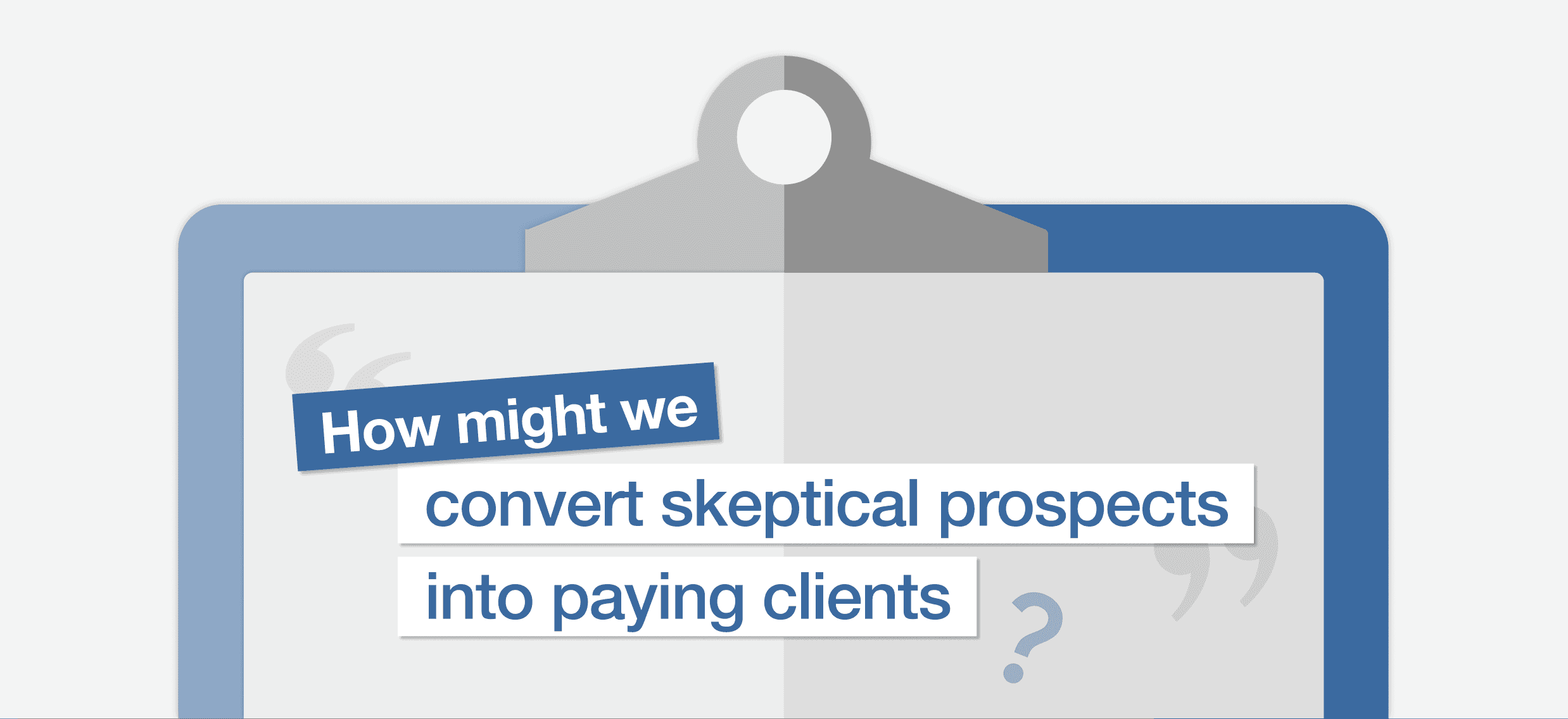
I spoke with the company’s founder to uncover hidden growth barriers
To diagnose the problem, I needed to understand the business from the inside out. I scheduled a 90-minute stakeholder interview with AlphaMed's founder to understand goals, challenges, and customer journey.

Parents seek credibility, students seek connection
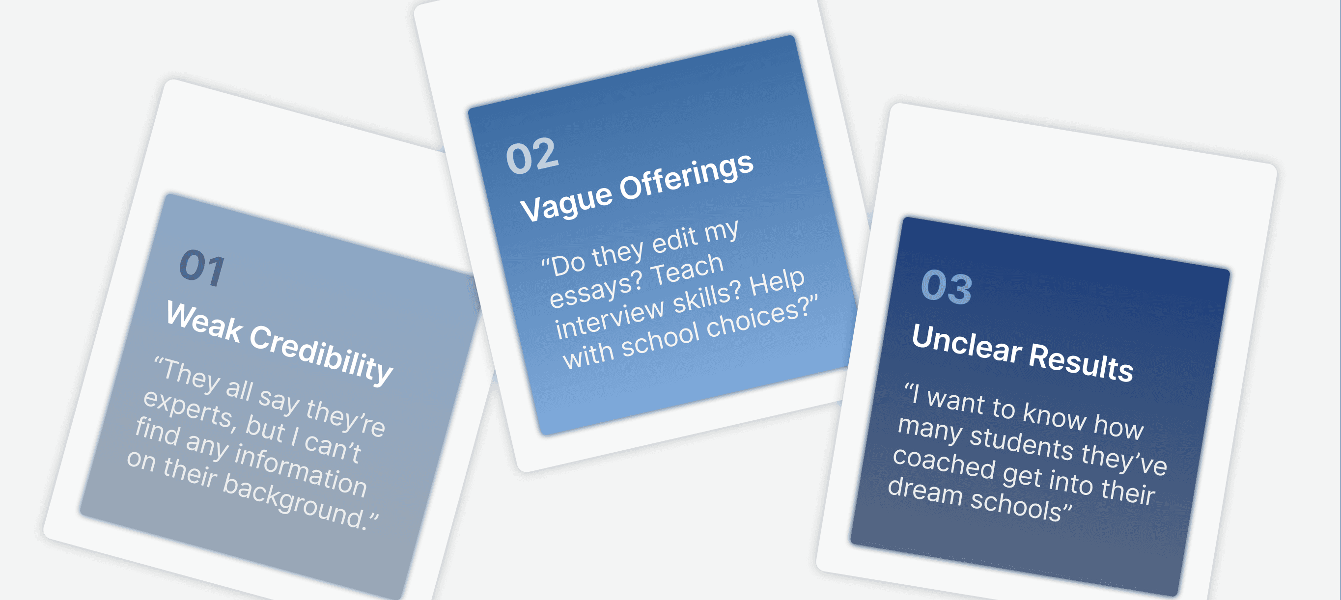
AlphaMed was struggling to resonate with their two audiences by failing to account for their different needs. Parents view academic counselling with skepticism, while students seek empathetic counsellors who understand the emotional toll of admissions. I reframed the challenge to reflect the needs of both groups:


This uncertainty emerged from three underlying issues:
IDEATION
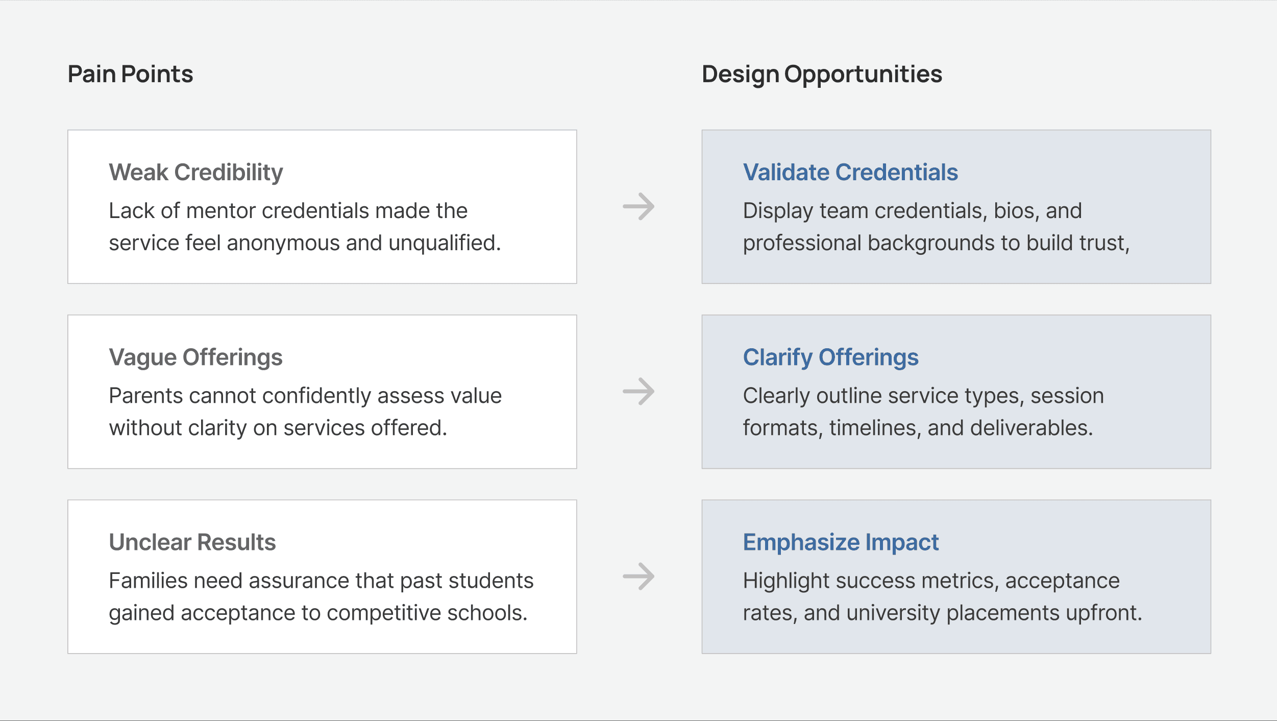
I leveraged these pain points to guide my design decisions
Building off these insights, I mapped each barrier to a design opportunity. The goal was to help visitors quickly understand why AlphaMed is a credible, specialized, and student-focused counselling service.
ITERATION
First, refining the landing page to showcase success metrics
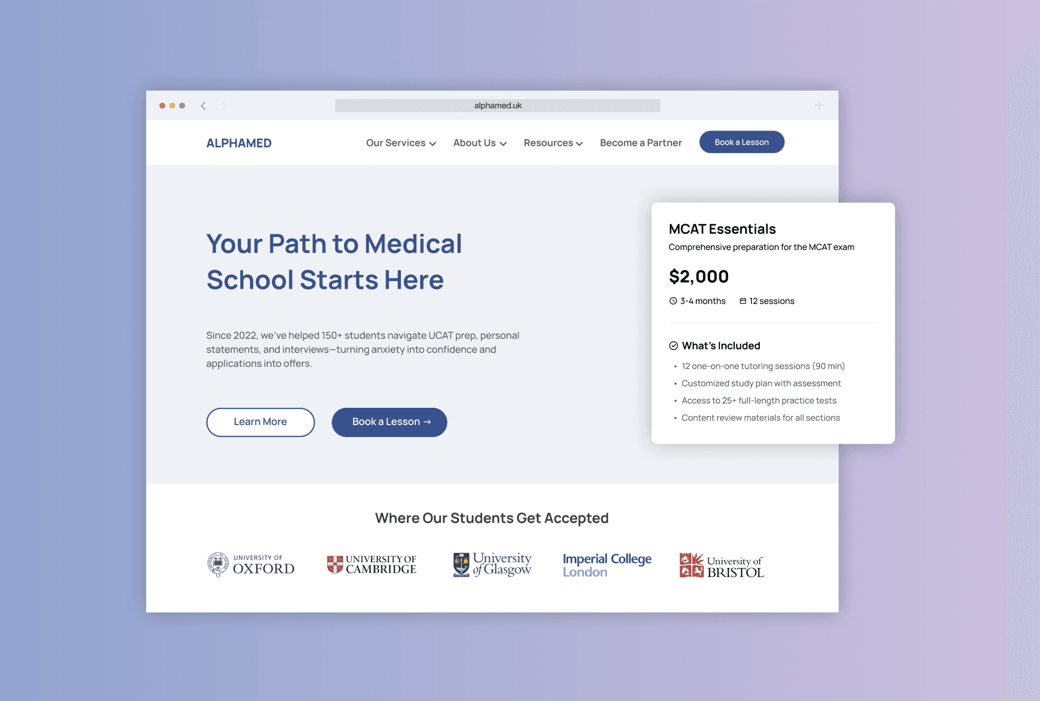
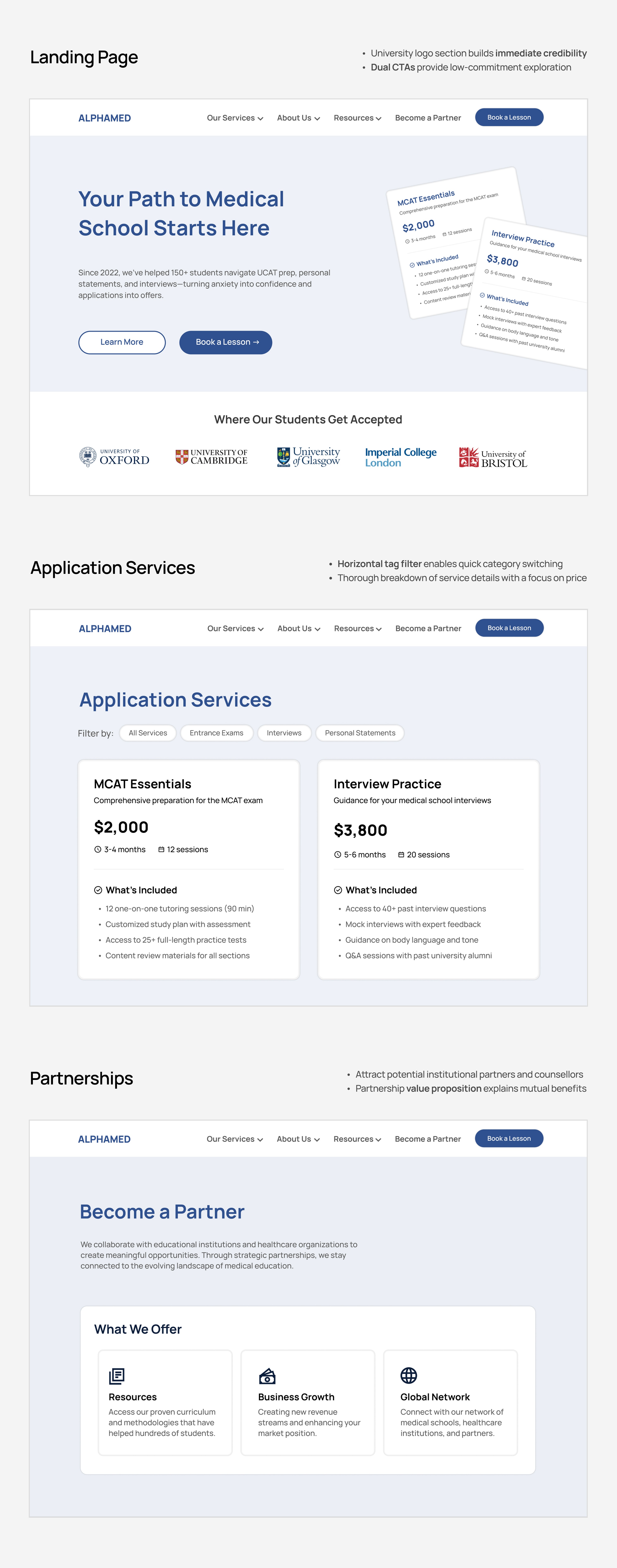
In 2025, AlphaMed achieved acceptance rates well above national averages. My goal was to present these results upfront to establish trust, while avoiding the data-heavy content that could overwhelm visitors. I explored various iterations of the landing page to prioritize the most impactful metrics and determine the best way to communicate them at a glance.

V1. Quantitative Metrics
✓ Statistics allow parents to research national averages and validate claims independently
✕ Parents unfamiliar with admissions may not be able to interpret certain statistics
✕ Numbers lack memorable differentiation and are easily forgotten

V2. Brand Recognition
✓ University logos bypass analytical thinking and trigger immediate emotional response
✓ Borrows institutional prestige by associating with top-tier universities
✕ Without context, university logos could appear as cherry-picked examples
Next, simplifying service offerings for informed decision-making
Medical school applications span multiple stages including entrance exams, personal statements, and interviews. User research revealed that parents felt overwhelmed figuring out what each offering entails. I iterated on the service cards to clearly break down the cost, timeline, and deliverables of each package.

V1. Single Accordion with Breakdown
✓ Explore services in depth without distraction from other offerings
✓ Minimizes vertical scroll by collapsing content into a scannable format until needed
✕ Must interact with each accordion to compare, difficult for decision-making

V2. Side-by-Side Service Cards
✓ Enables quick comparison of prices, duration, number of sessions, and deliverables
✓ Immediate service breakdown that addresses major pain point (unclear offerings)
✕ Users seeking specific services must read through irrelevant options
FINAL DESIGN
I combined the strongest elements of each iteration into the final design
Want to hear the full story?
Please reach out to me if you'd like to learn more! I typically share my complete research process and detailed design explorations in an interview setting or coffee chat.